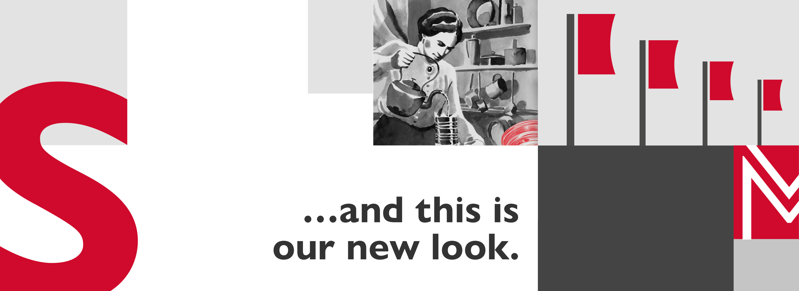
Self-assured: our new logo!
Clear, simple and well-proportioned. With our redesigned word mark we are placing the emphasis where it is right for us: independence, high quality and safety standards for our partners - it’s all there in Melitta® PROFESSIONAL.
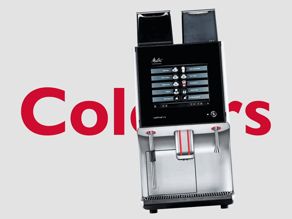
Clean lines with new colours
Black, grey and Melitta red: these are our primary colours, like a standing leg, derived from our fully automatic coffee machines. What’s new is the free leg. Subtle, warm tones reflect the variety of our products and fit perfectly into the contemporary world of catering.
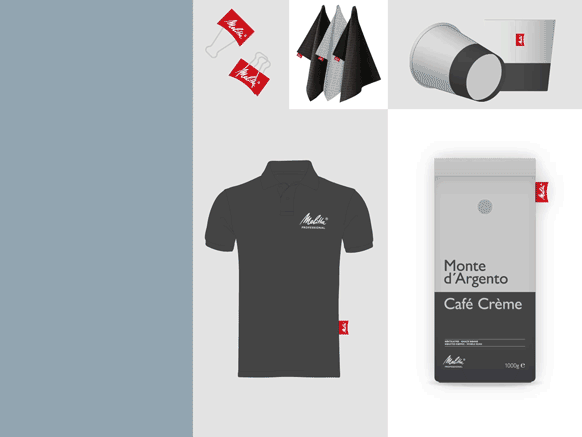
Fly the Melitta® flag
Raise it, pin it: this small but smart accent stands out from other brands - and goes down well with consumers as a quality seal. There are plenty of examples of where to use it! But take care: the flag is an effective add-on, not a must-have.
Vision & Ambition
Distinctive! We have sharpened our brand profile and asked ourselves: which strengths, which special capabilities make us different? This resulted in strategic signposts. With a shared vision and ambition, we want to set off in the direction that will take us further forward.